📝 My Role in the Project
📍Lead UX/UI designer
📍Carrying out UX audit and stakeholder interviews
📍Writing the scripts, conducting and analyzing user tests
📍Designing the look and feel concept, and design system for new version
IN SHORT
Refining a web app for automatisation of cryptocurrency investing. At the point of hiring our team by the client, the app was at an advanced stage of development. The client wanted to test it before the actual launching. During an in-depth usability audit we detected many errors. The client decided to commission us to redesign the whole product.
Challenge
📈 Improving the retention
💬 Increasing the efficiency of communication
👶 Simplifying interactions for non-professional users
⏩ Speeding up the process of creating new strategies
Result
🏆 Increase of the usability score from 60 to 94 points after the redesign
👍 A positive opinion of 90% of users testing the new version of the app
audit and UX research phase
1. User tests
The methodology applied for the user tests were two user scenarios.
🔍 The first scenario assumed a use of the web platform without reading up any information about it, simulating acquiring the user in an organic way. It allowed us to find all communication and microcopy errors, and to gather any comments about the usefulness and essence of the platform
🔍 The second scenario was supposed to detect any problems with the usability of the platform from the point of view of an experienced user, and to find possible interface flaws that could reduce the retention
2. Heuristic analysis
The analysis was based on heuristics of usability (rules and hints) that make the assessment of a platform possible. We used Nielsen and Molich’s 10 usability heuristics.
We checked whether the platform carries any common mistakes, and whether the information architecture was planned in a way that would lead to a conversion. Thanks to basing the research on pre-prepared rules, we were able to repeat an analysis after implementing necessary improvements and to evaluate the progress.
3. Usability checklist
We inspected the platform’s usability according to a detailed guideline checklist. It’s the most objective way of usability evaluation, based on an algorithm. It’s also the most measurable and most precise. The compatibility assessment is clear – every piece on a checklist is rated on a three-point scale.
4. The cognitive journey
Outside of the users’ tests, we executed structured scenarios’ analysis.
We checked every single aspect of the platform, taking into consideration different potential users’ points of view. We tried to analyse any possible errors and impediments on a user’s path.
The methodology allowed us to assess the eligibility and smoothness of the execution of a chosen process or processes on a website / in an app. Unlike the heuristic analysis, the main focus was put on a smooth flow of the whole process and not on separate elements.
5. Conclusions
After analysing the results of all of the methods above, we selected several elements to be improved for each view.
Apart from numerous defects forcing the UI improvement, one of the most important elements that we had to improve was the communication between the platform and its users.
The most important recommendations were:
🔍 developing a consistent design system for all of the elements and interactions
🔍 deciding on a consistent style for tables (headers, data entries, interactions, sorting modes)
🔍 unificating and simplifying the sections responsible for data input
🔍 improving the registration process, adding an option to log in by an external service
🔍 adding a social proof or a value proposition to increase the conversion rate for the registration screen
🔍 developing the prime path, onboarding, and an onboarding tour for the user
🔍 designing an empty state views
🔍 adding new functionalities: configurable widgets for the screen, notifications and desktop alerts, fluctuations in exchange rates, charts of currencies you are watching, top trending lists, statistical verifiability of market forecasts, cryptocurrency rates’ observations
II. The UX / UI redesign phase
The Project
Original design
Redesigned version
Design System
To guarantee the consistency of all the elements for the project that big, we developed a set of repeatable rules and components that form subsequent pages and solutions for the product.


The registration screen
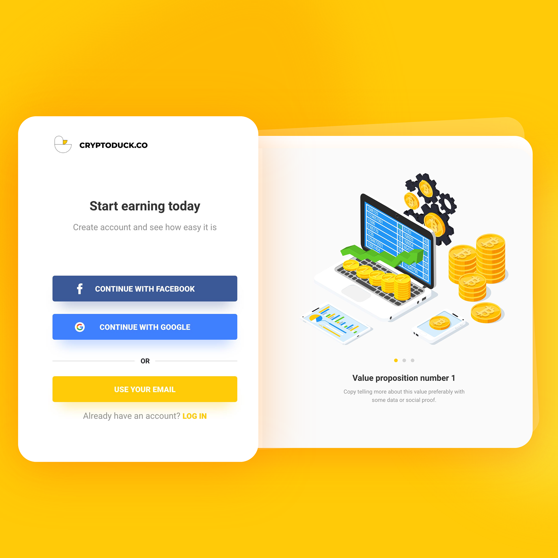
To increase the registration rate we improved the whole process and added an option of logging through an external service – Facebook or Google. Both buttons were placed in a visible spot, as a default registration option.


Strategies and signals
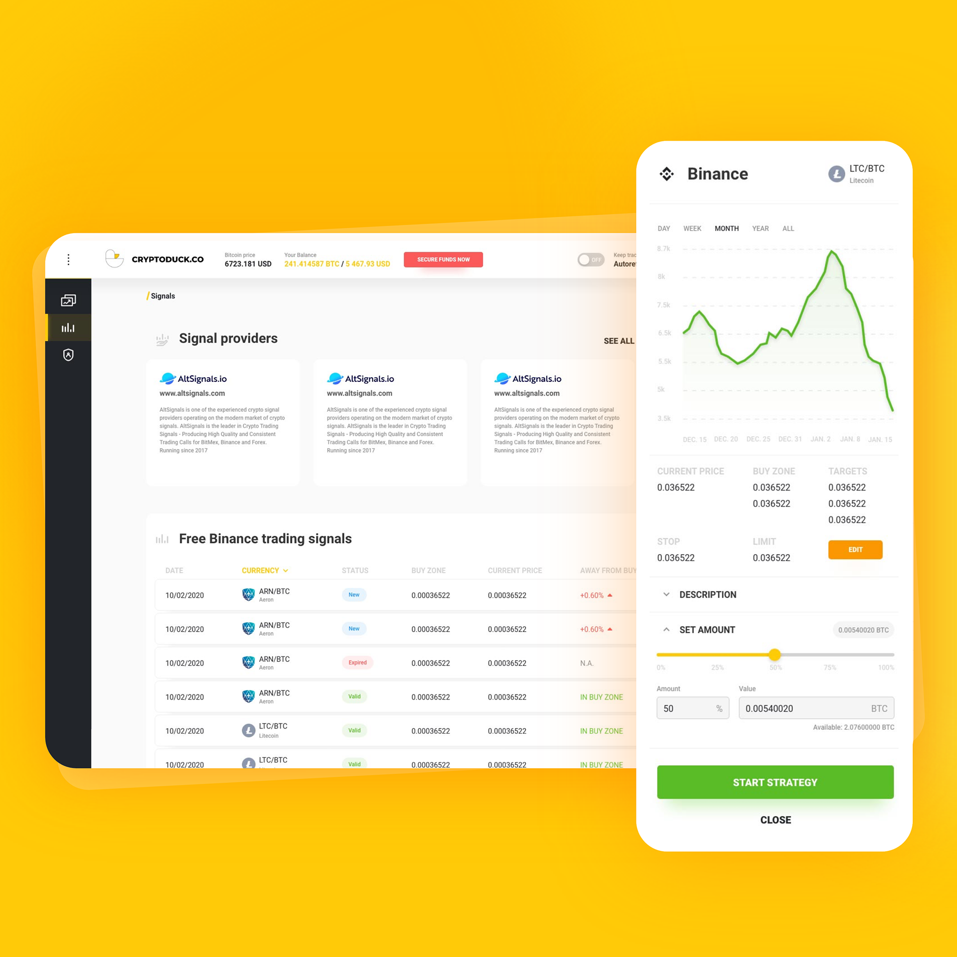
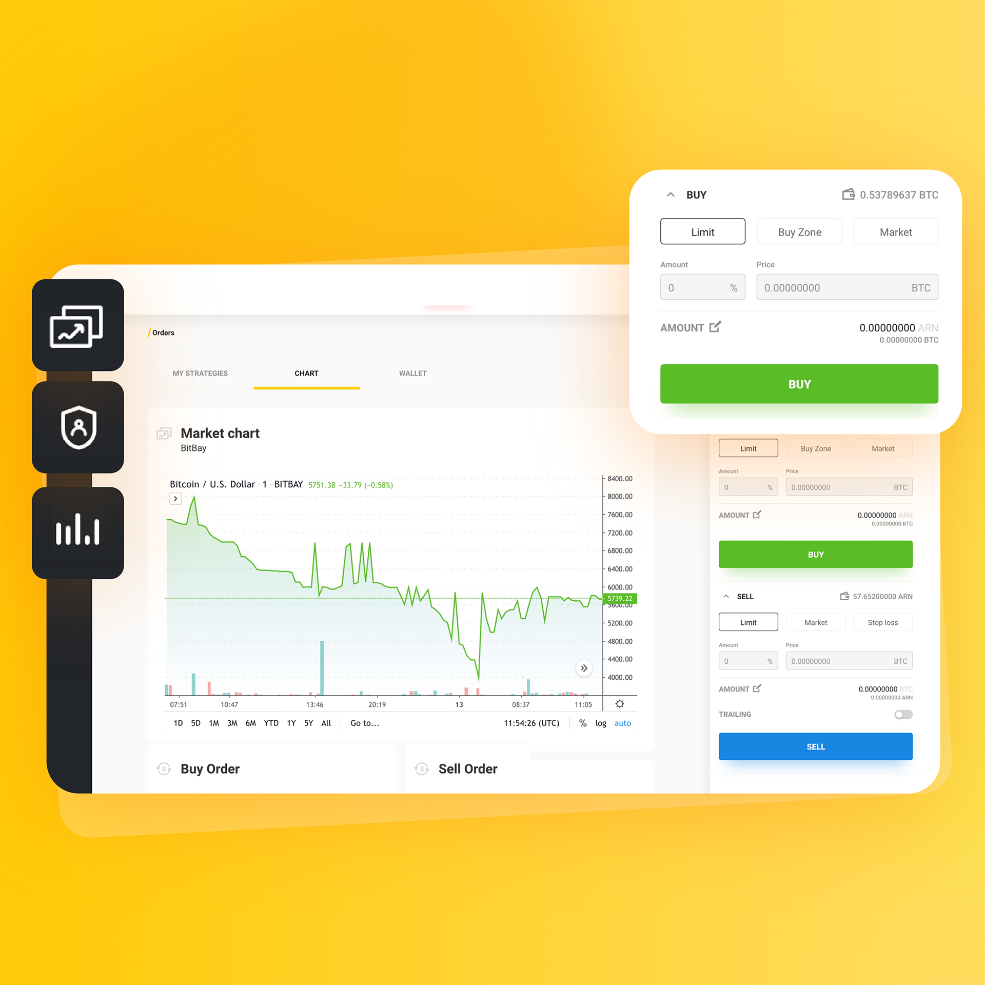
The most important elements of the platform, such as data tables and panels dedicated to creating new strategies, got unified and simplified. We took care of designing a well-organised information architecture, visual distinguishing features, and clarity of interactions.
We limited the number of steps for each screen, breaking every stage into minor interactions.
User account and settings
