📝 My Role in the Project
📍Lead UX/UI designer
📍Carrying out the whole discovery phase
📍Benchmarking and competitor review, stakeholder interviews, discovery workshops
📍Writing the scripts, conducting and analyzing user interviews
📍Creating UX foundation document and low fidelity wireframing
📍Designing the look and feel concept, and design system
📍Co-creating high-fidelity wireframes and mentoring UI design team consisting of one mid UI designer, and one junior UI designer.
📍Conducting and analyzing user tests. Close cooperation with the dev team during further website development (pre launch and after)
🔥 In short
We invented and designed a portal for finding and recommending places friendly to parents with children. The entire system has been designed to support both users (children's guardians), and key customers (that is representatives of the mentioned places) of the portal.
✅ The Challenges
📍Development of the entire logic and strategy of the product – the client came with the general idea of "booking.com for parents with children"
📍Easy, fast and intuitive place search
📍Offering clear value for both parents and venue owners
📍Very diverse needs for children of different ages in terms of facilities
📍Smart and relevant suggestions of places in terms of different needs and expectations of users
At the start of the discovery phase
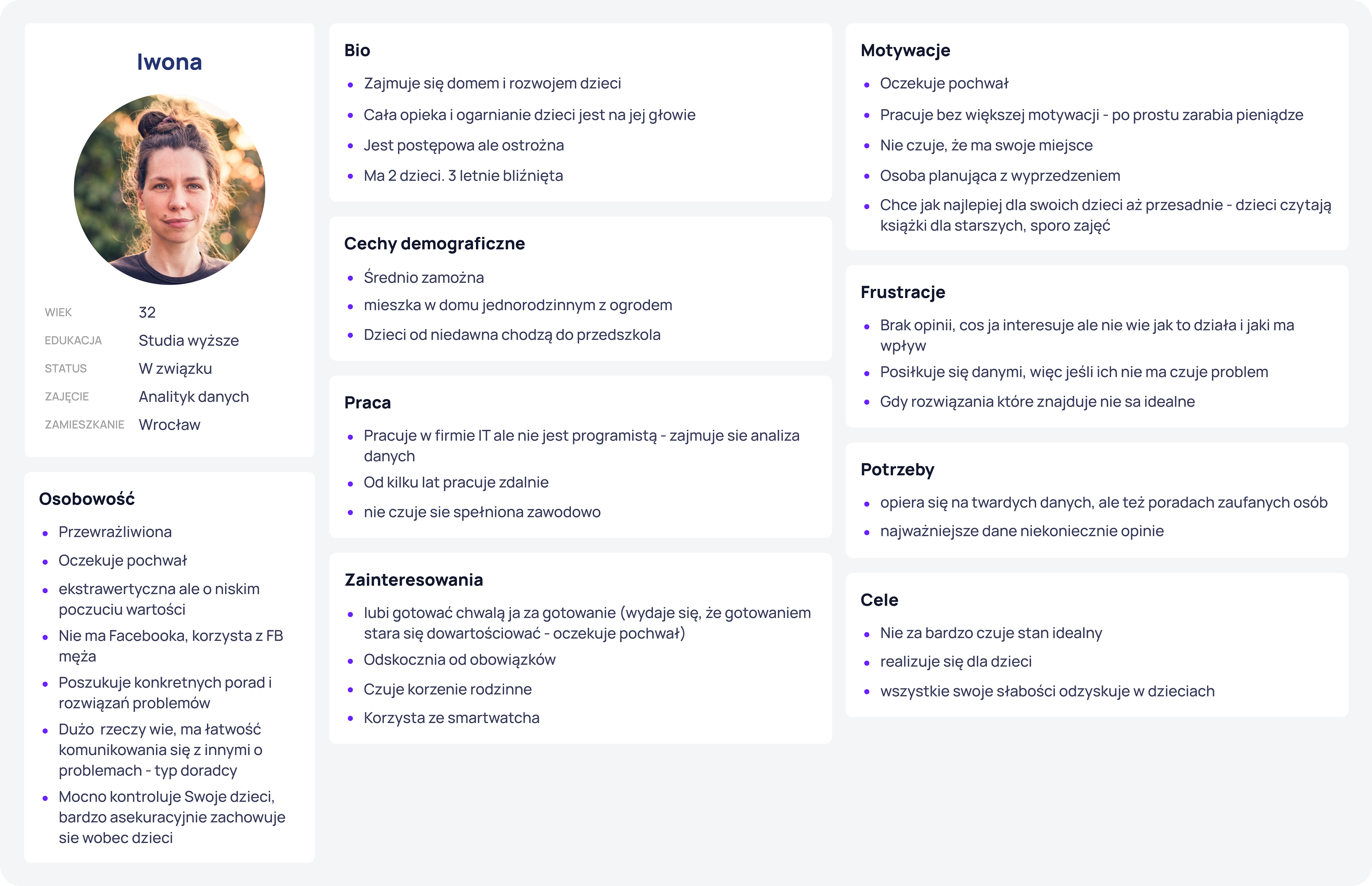
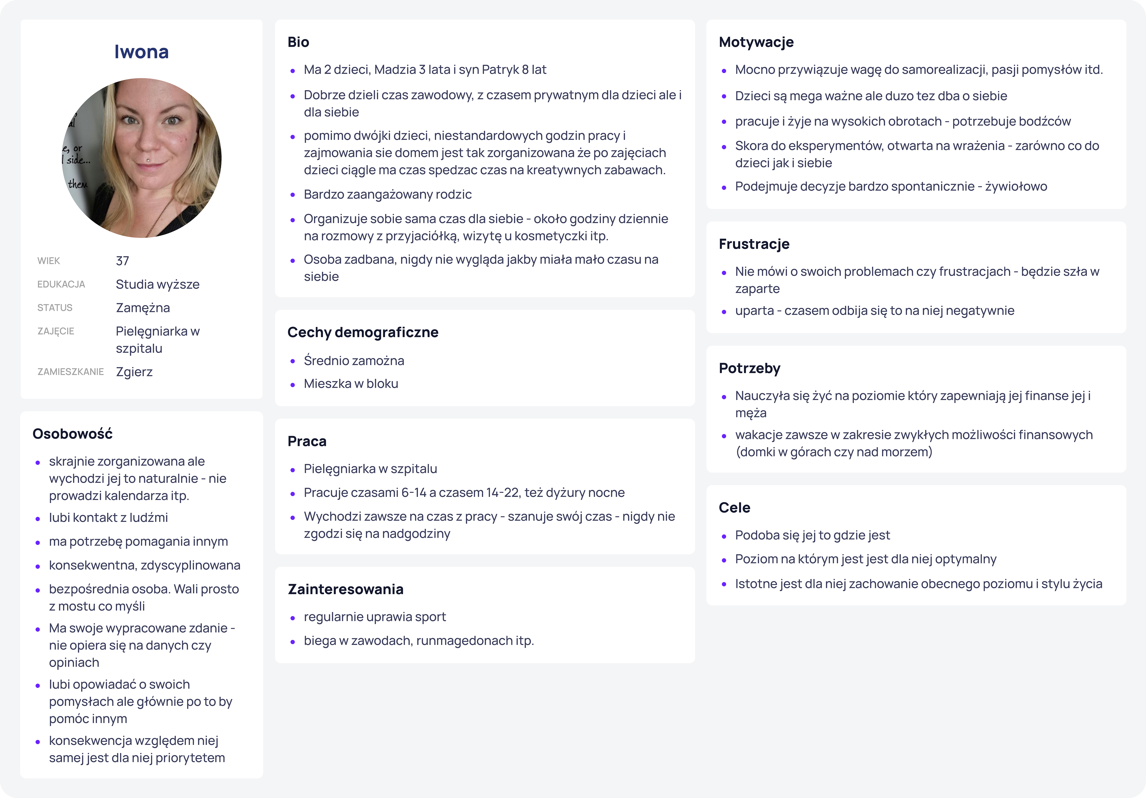
First, I conducted a series of discovery workshops during which, among other things, we developed personas of our future users, defined business goals and metrics, and defined what the website should and should not be. It also helped us identify our closest competition in the market.
An advanced search engine is essential
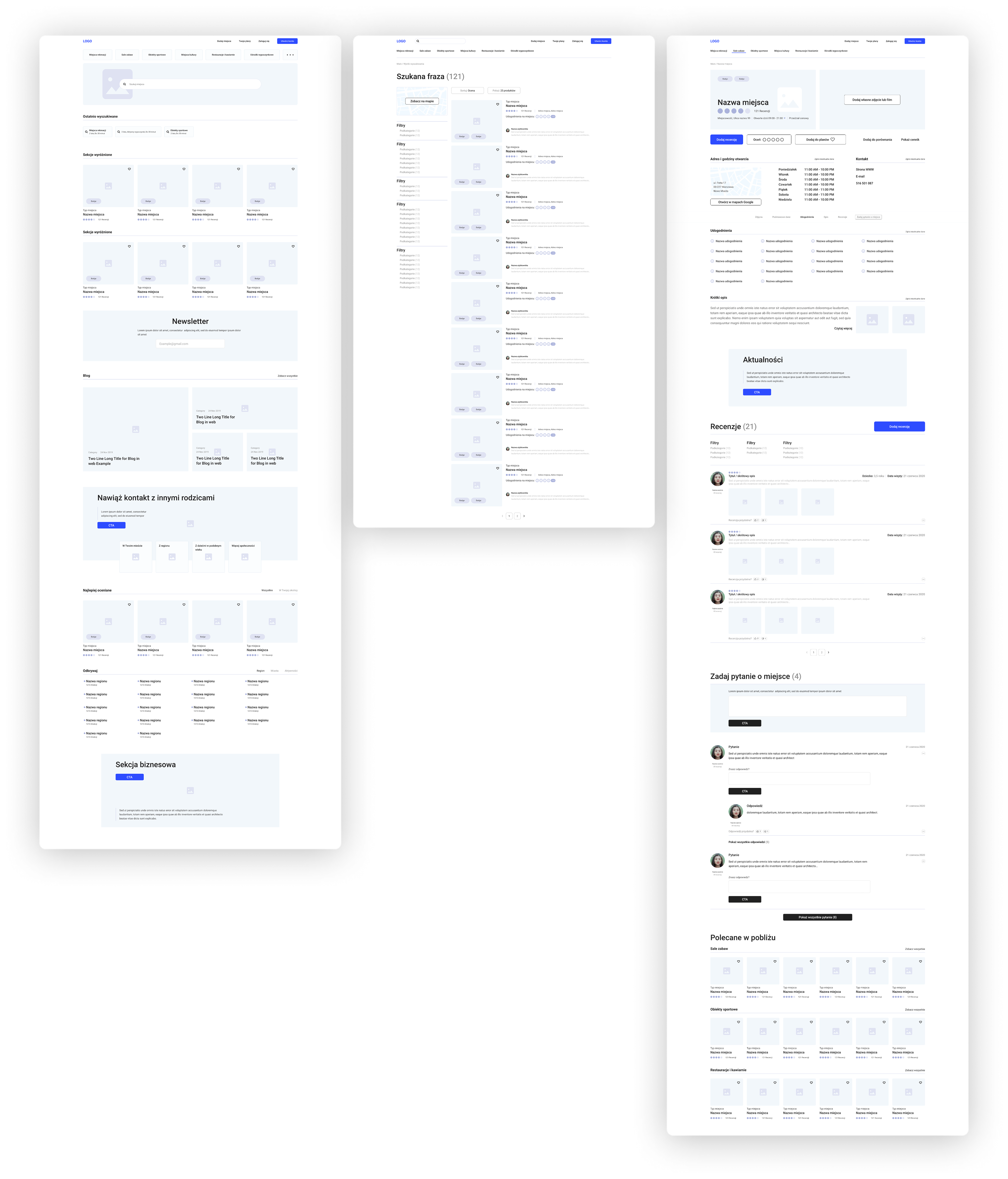
The search engine was the heart of the entire website. It was crucial for us to understand through research what parents would actually be looking for, and based on what criteria.
To this end, I conducted a series of in-depth interviews with both parents and business representatives. I further deepened the insights found during this research through quantitative research conducted on a pool of about 100 future users.
Once we acquired this knowledge, we designed the search engine with relevant suggestions based on interests, age of children, accessibility and distance.
UX foundation and Wireframing phase
After completing all research stages, I developed a UX foundation document describing the entire architecture, logic and functions of the system.
Then, based on this documentation, I designed the layout of the most important views in low-fidelity – which we validated during corridor tests.
Business panel
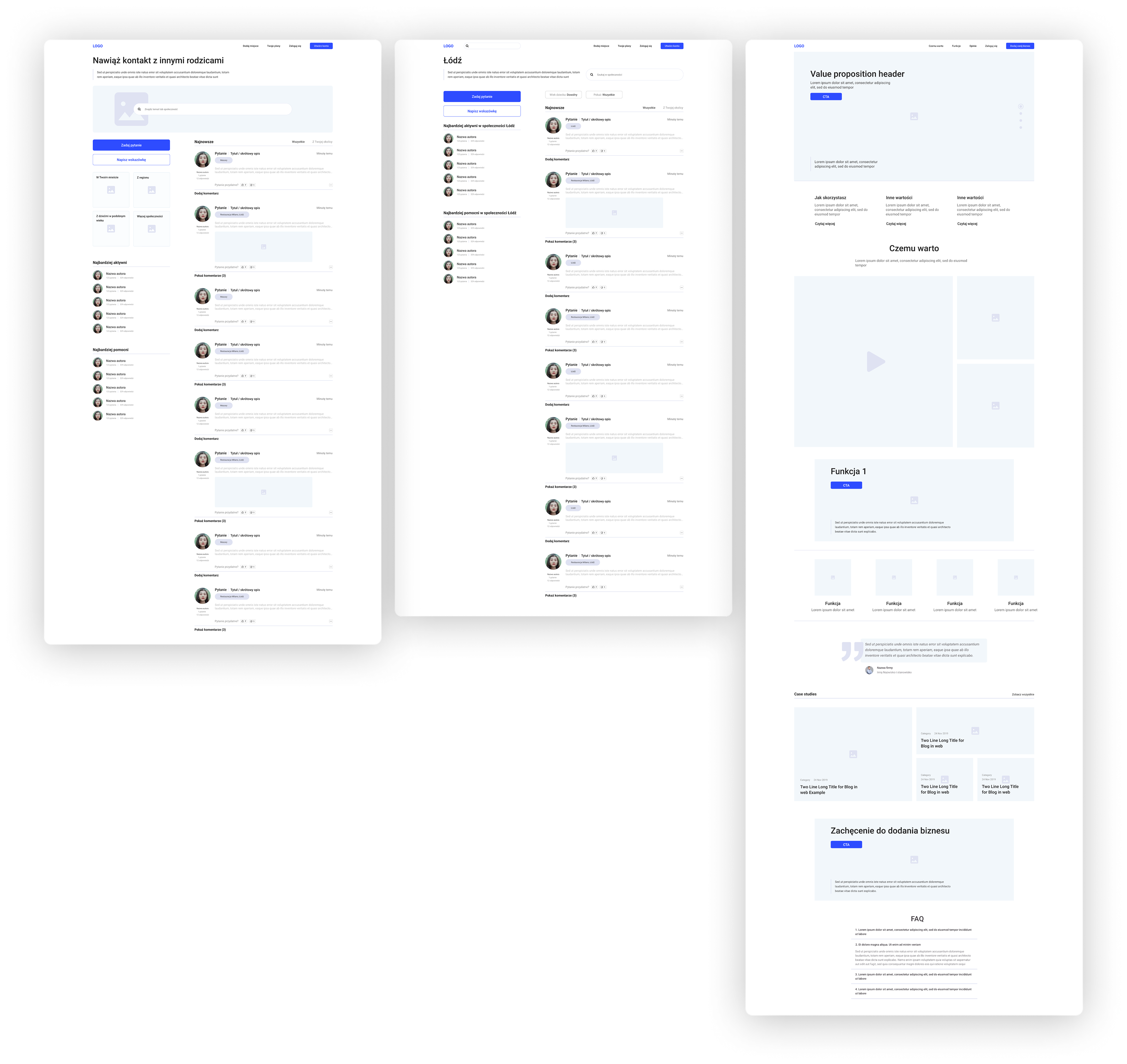
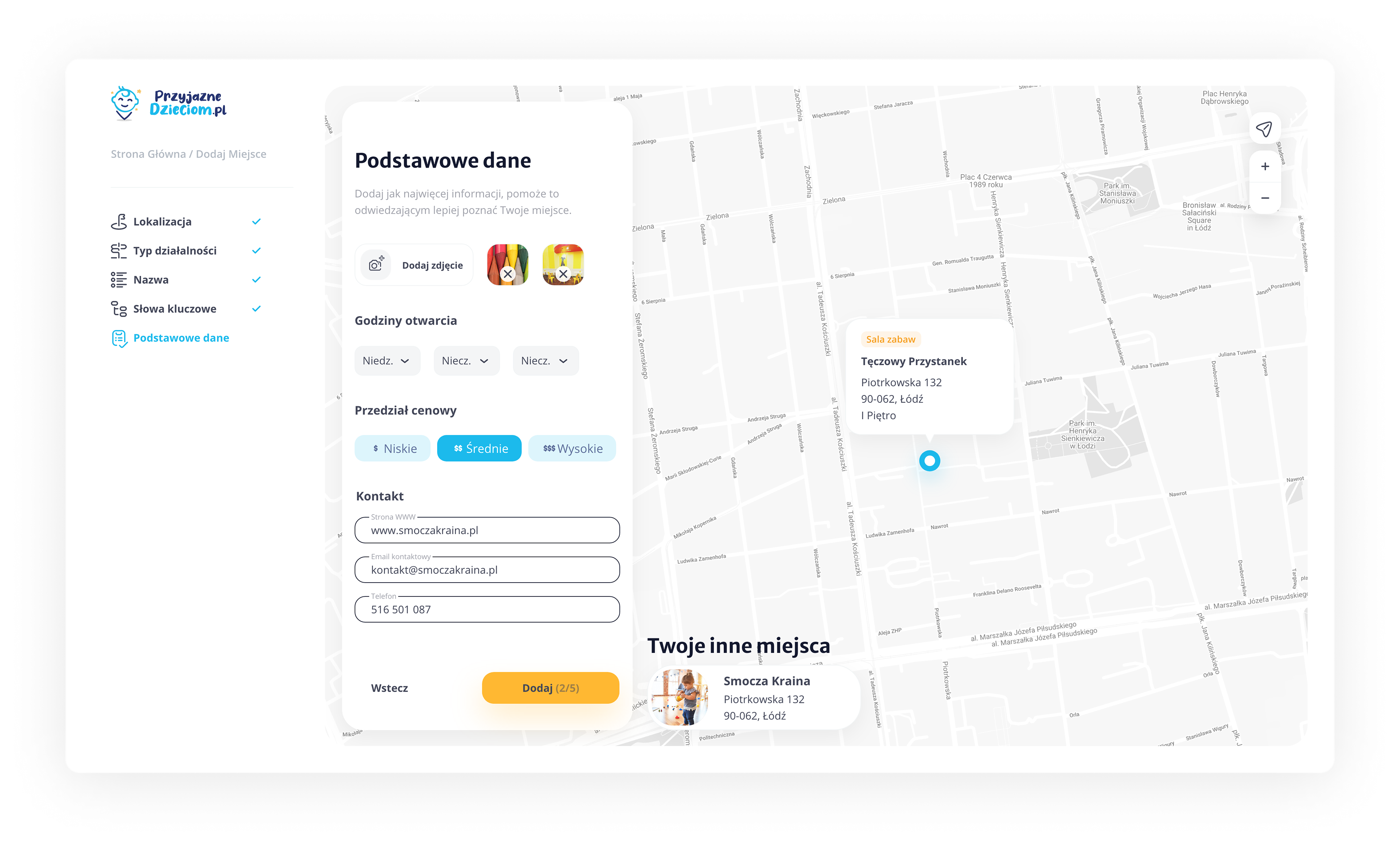
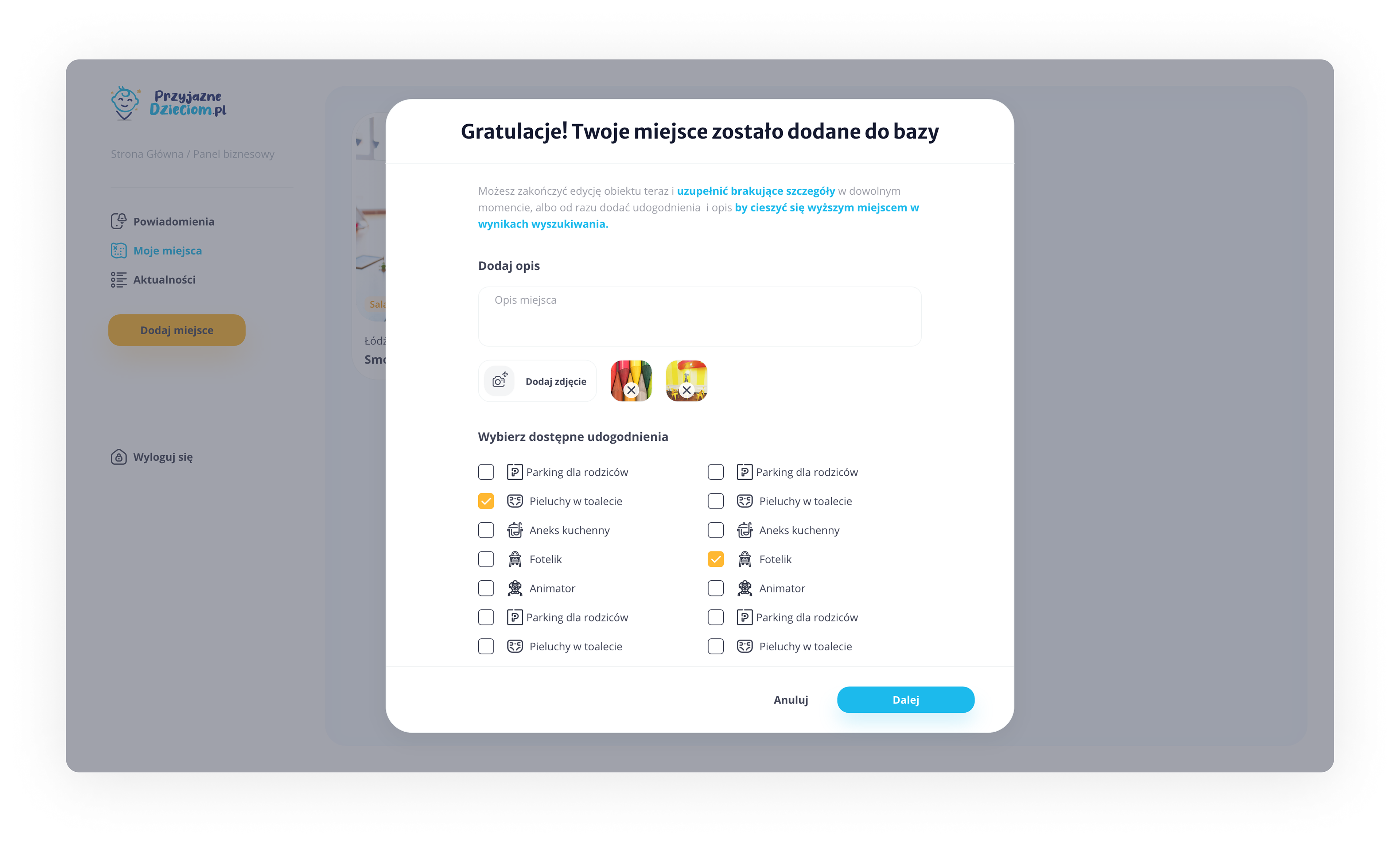
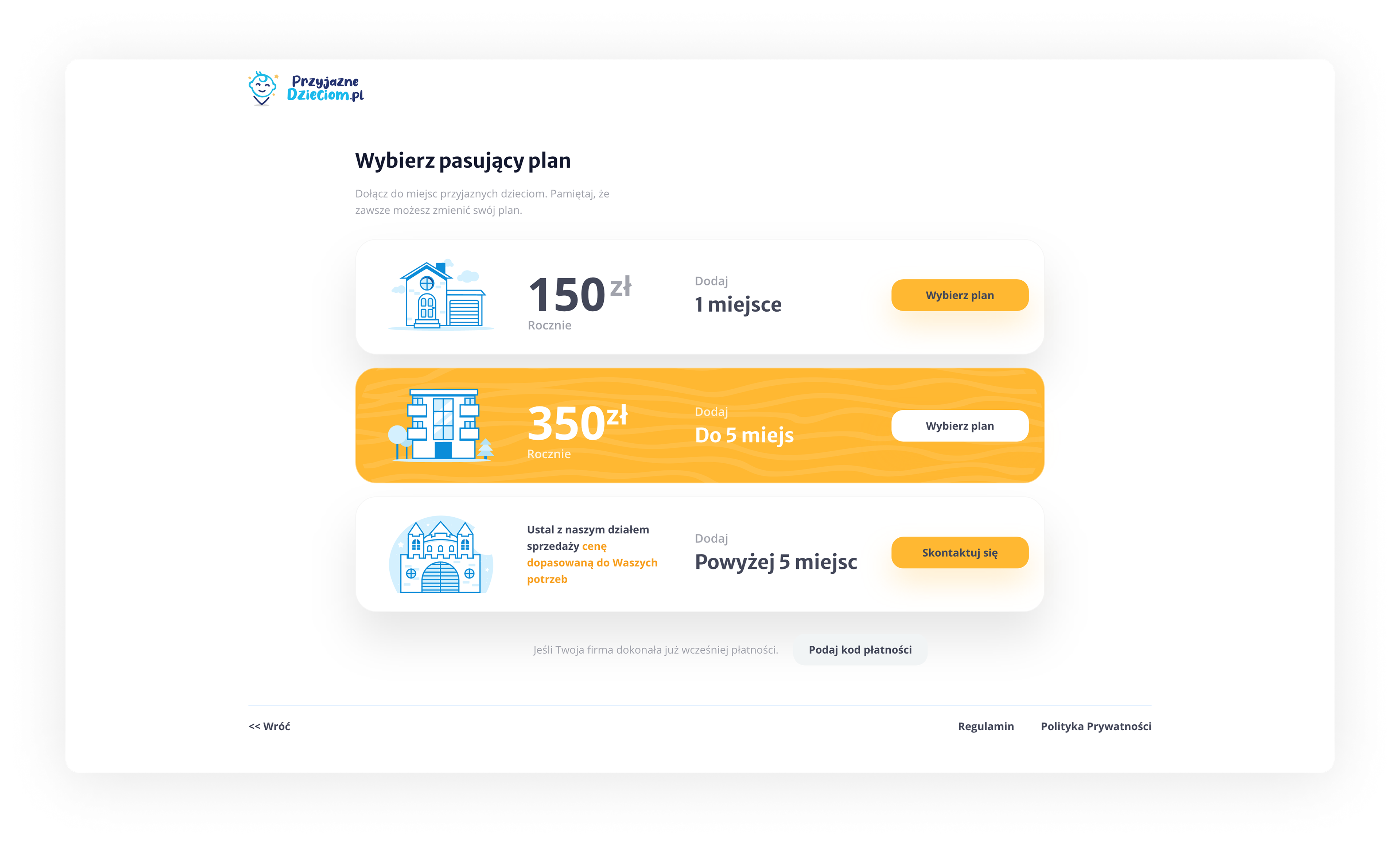
The content management module on the website and the administration of places in the search engine were also important. As part of it, we have designed easy and quick ways to add and manage new places, answer questions and get instant notifications about activities on places' subpages.

The social element, meaning growth of the platform
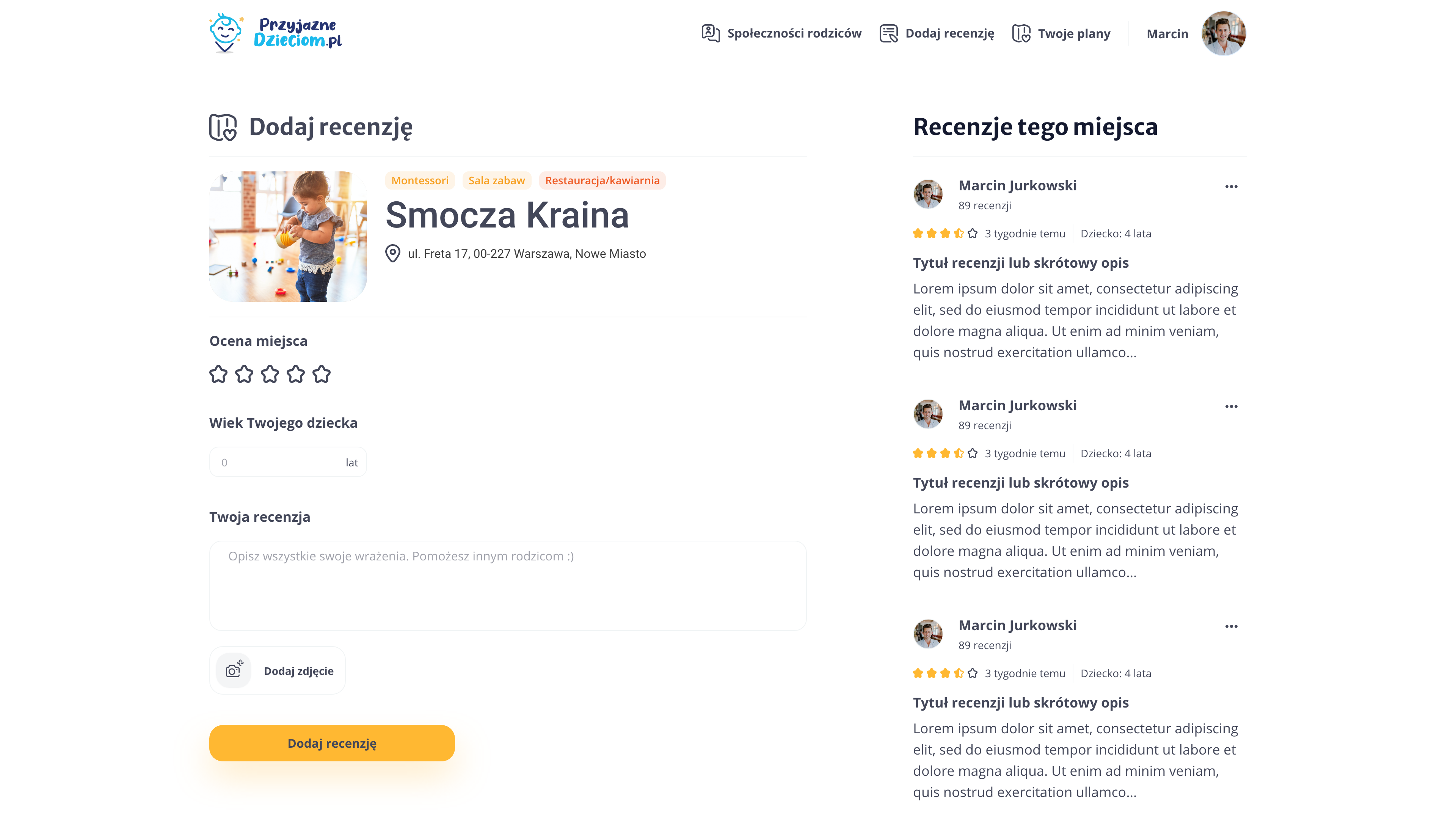
In order to bring the portal to life, we knew that we would need to engage users with social systems. We have designed a question and answer system that facilitates the verification of information about places on the platform. In addition, removing the need for this type of communication from customers (i.e. place owners).

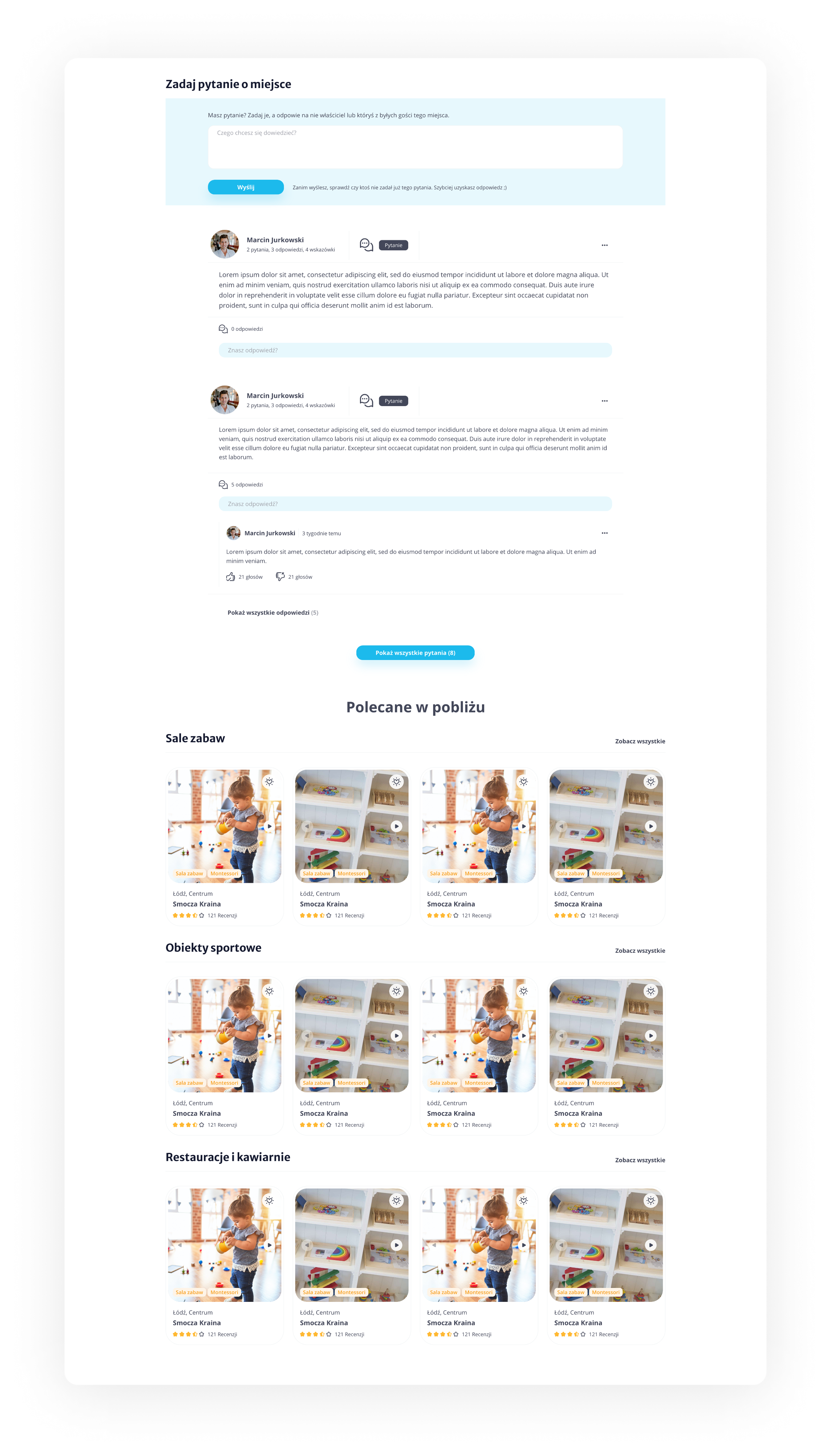
We have also introduced a system of badges/awards and activity statistics to further help initiate conversations between users.

Branding and visual style
We have prepared a full visual identification of the website with a coherent system of illustrations and iconography.
