📝 My Role in the Project
📍Lead UX/UI designer
📍Carrying out the whole discovery phase and initial UI design for the whole platform
📍Facilitating discovery workshops, benchmarking, competitor review and stakeholder interviews
📍Creating UX foundation document and low fidelity wireframing
📍Designing the look and feel, and design system
📍Creating high-fidelity mockups
📍Close cooperation with the dev team during further website development (pre- and after launch)
📍During second design phase: Facilitating discovery and ideation workshops, co-creating high-fidelity wireframes and mentoring UX/UI design team consisting of: one mid UX/UI designer and one junior UI designer.
🔥 In short
I have designed a tool for measuring, reporting and reducing CO2 emissions for large companies and corporations. The system has been designed to be both simple and intuitive, but also fully compliant with the GHG protocol, a tool used to account for greenhouse gas emissions in the EU.
✅ The Challenges
📍Creating a system that can be operated by users who do not have expertise in the field of carbon footprint reporting
📍Designing a tool that replaces the physical presence of carbon accounting auditors in the company
📍Finding ways to clearly present a lot of data from many sources, in a way that allows them to be analyzed from different angles
📍Developing a seamless and secure way to delegate tasks both inside and outside the organization to complete the report
📍Designing the tool so that it is universal for both smaller companies and large corporations with many different roles and needs in the system as well as connections between them.
The beginning of the project
As usual, I jump-started the project with a stakeholder interview during which I learned about the most important metrics and assumptions of the project, both from the business, executive and functional side.
However, the most important task when I started working on this project was to understand its specifics. It was all the more difficult as carbon footprint reporting is a very niche discipline, which until now has been dealt with by narrowly specialized auditing companies.
So I had to start with at least a fraction of the knowledge of such a person so that I could then emulate their presence in the system. You can say that my task was to create a virtual auditor who will ask the right questions and guide each user of our tool.
Thus, I started multi-week workshop sessions with stakeholders in the form of two carbon footprint auditors and the owner of the project.
benchmarking and competition analysis
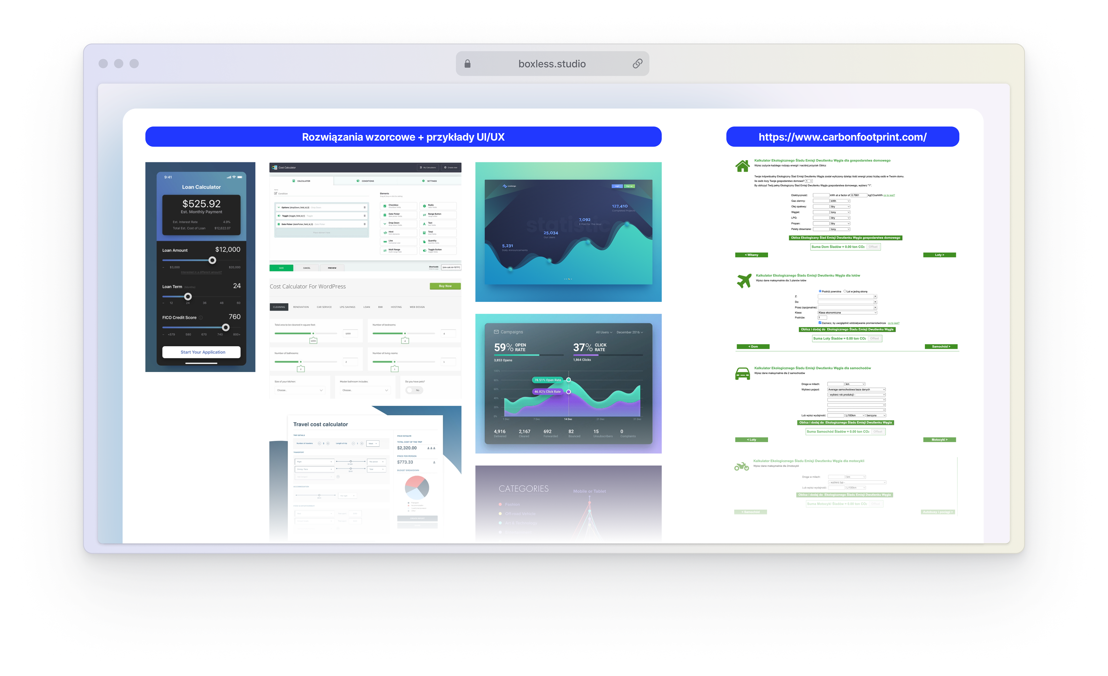
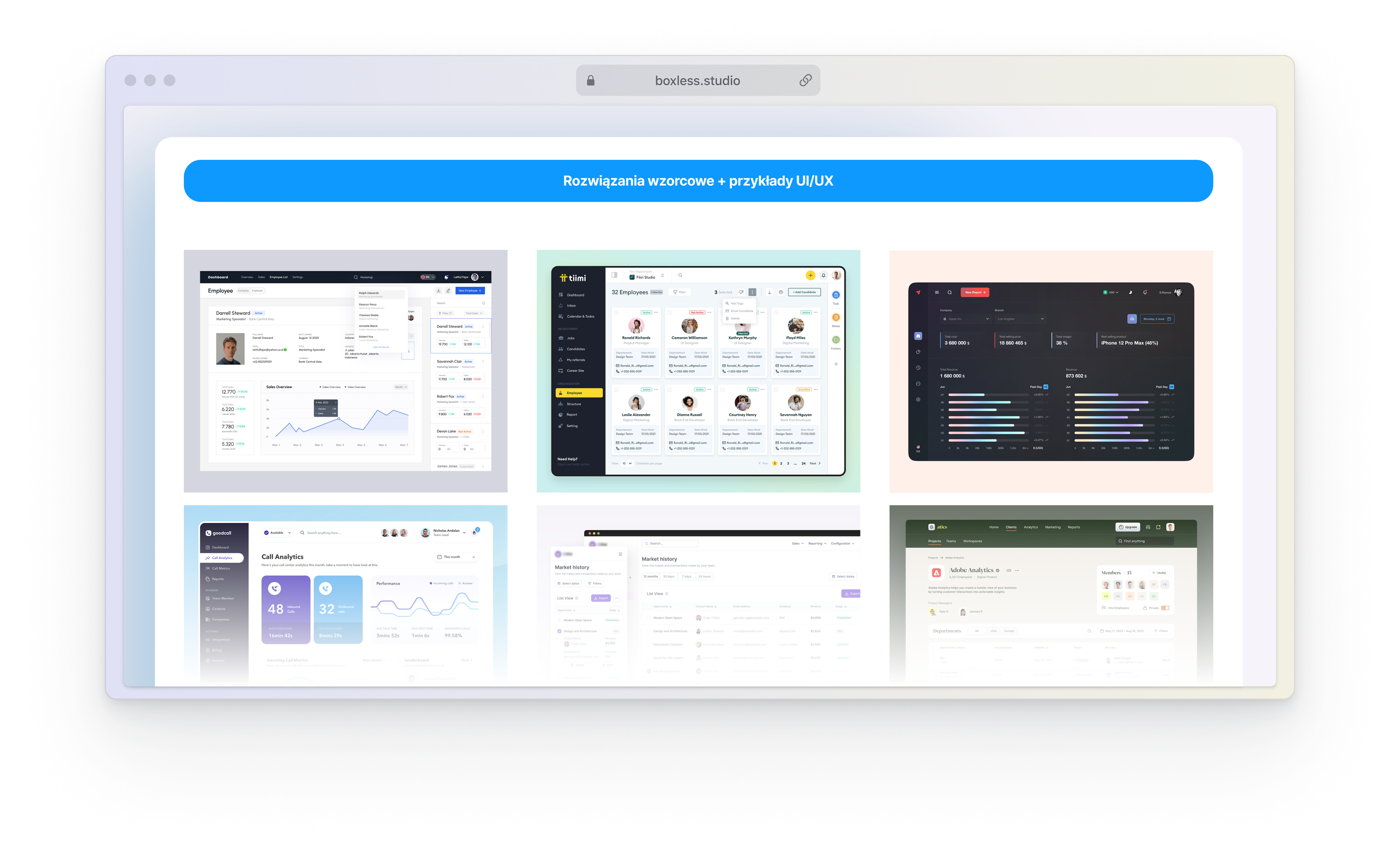
In addition to intensive discovery workshops, it was very important to learn about the competition in the field of digital carbon footprint reporting. This turned out to be quite a challenge as this market is currently in its infancy.
Existing platforms, however, do not offer easy access beyond the possibility of viewing their landing page, which made my task much more difficult. So I decided to investigate additional tools with similar characteristics, thus hoping that the Jacob's Law will work this time as well.

Development of the basics
Before we were able to finish the workshop, a document that formed the basis for full documentation of the portal's architecture and logic, i.e. UX foundation, began to be created.
With such a large and advanced system being built from scratch, I felt it was necessary to iterate through this document from the very beginning.
This allowed me to create a wireframe that we could quickly and efficiently develop at the level of the documentation itself. Which, as it turned out, greatly accelerated the next phases of UX design, including the proper low fidelity wireframes.
proper documentation - ux foundation
With the conclusion of the discovery and ideation workshops, I jumped in to create multi-page documentation of the architecture and logic of the entire system. In addition to being the list of all screens, functionalities or roles in the system, it allowed us to validate and check thought gaps that may have appeared while creating it.
Low fidelity wireframes
After accepting the structure and logic of the tool, it was time to start working on the visual aspect of the system. Thanks to the earlier stage of benchmarking and work on documentation, I knew practically from the beginning what I wanted the basic user dashboard, notification views, sharing and transferring tasks or profile to look like.
What was left to work out, was the most difficult piece of the puzzle. That is, the very method of extracting information from the user about the sources and the level of the carbon footprint generated by his company at the level of information in accordance with the GHG protocol. I owe the design of this area to our many weeks of joint workshop work in miro with the two auditors I mentioned before.
This is how the visual sketch of the most important views of the system was created. After a few quick iterations, it was accepted by stakeholders and I was able to move on to the high fidelity design phase.
Look and feel, breakpoints, design system.
For such a large system, it was necessary to create a sufficiently flexible grid, a coherent system of interactive components, colors and other UI elements that would guide the user through all scenarios.
Although we knew that people would mainly use our desktop version of the system for data entry, some interactions and use cases should also be convenient from mobile devices. That is why the most important screens and interactions have also been designed in mobile versions.
Painless first entry
We knew that one of the most important sales aspects would be the presentation of the first entry to the platform - from a business point of view, it could be available even as a demo function. So I had to design it so as to quickly give the user positive feedback from the data entered by him.
In addition to quick registration, as one of the first steps, I implemented a system that organically teaches the user the basic elements of the interface, at the same time extracting from him basic information about the company. Thus, we can position such a company in the segment selected for it, benchmark it against its competition and roughly estimate its carbon footprint.
Of course, I have not forgotten about the onboarding system and feature discovery - both for the desktop and mobile UI versions.
crème de la crème - reporting system
That is the most important function of the system. Divided into areas, the possibility of shallow or deep reporting, validation of entered information and many other functions. Above all, however, it was designed not to overwhelm the user, but to extract information step by step in accordance with the classic rules of Hick's Law and Goal-Gradient Effect.
sharing is caring
The premise of the entire product was to combine dispersed knowledge about the company and the departments generating its total carbon footprint. We knew that not a single person in any company has this kind of knowledge. So I had to create an easy task delegation system in the product and outside it, e.g. to send a query about the carbon footprint generated by the power plant servicing our factory.
This, in turn, entailed the need to create a notification system, informations about pending tasks or a system for monitoring them and sending reminders.
Going beyond MVP
Less than a year after handing over the finished project and then supporting client's IT team in its implementation - the client returned with the task of expanding the portal with new functionalities going beyond the MVP area.
After refreshing the knowledge about the project and this time with the help of two additional UX/UI designers, we started another round of stakeholder interviews and workshop sessions with the client.
On its basis, we determined the scope of changes. It was so large that it required from us again a series of strenuous ideation workshops.
Having a design system is just easier
Having a well-made design system, made it easier for us to create new designs right away in the form of high fidelity mockups. This did not mean, however, that there was no mental work. In this phase, we really spent a lot of time creating use cases, drawing user flows in Figjam, diagrams or doing brainstorms on changes in logic and architecture.
At the beginning, we reworked the possibility of reporting the carbon footprint of not only one company, but all subsidiaries in which we have at least a single share or other connections.
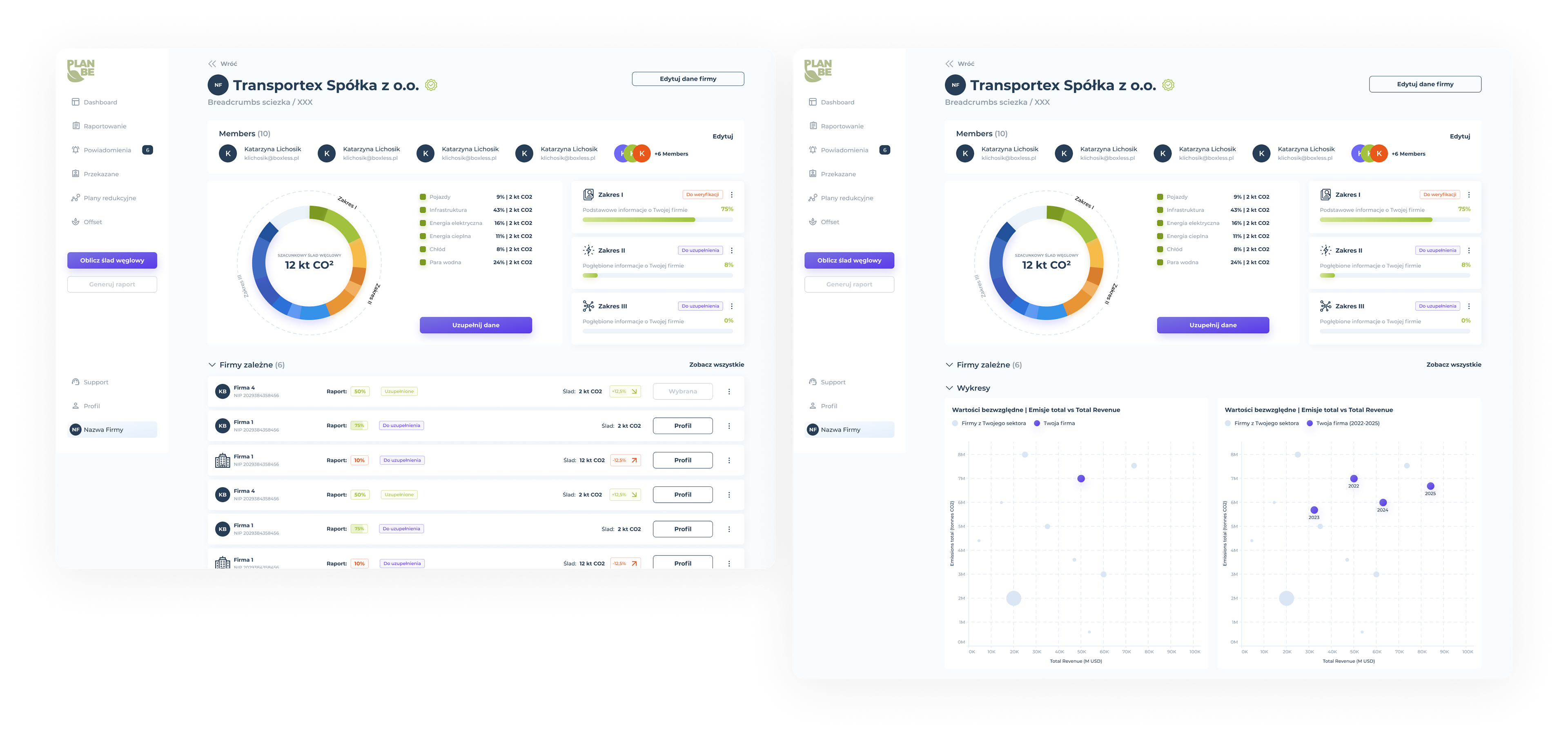

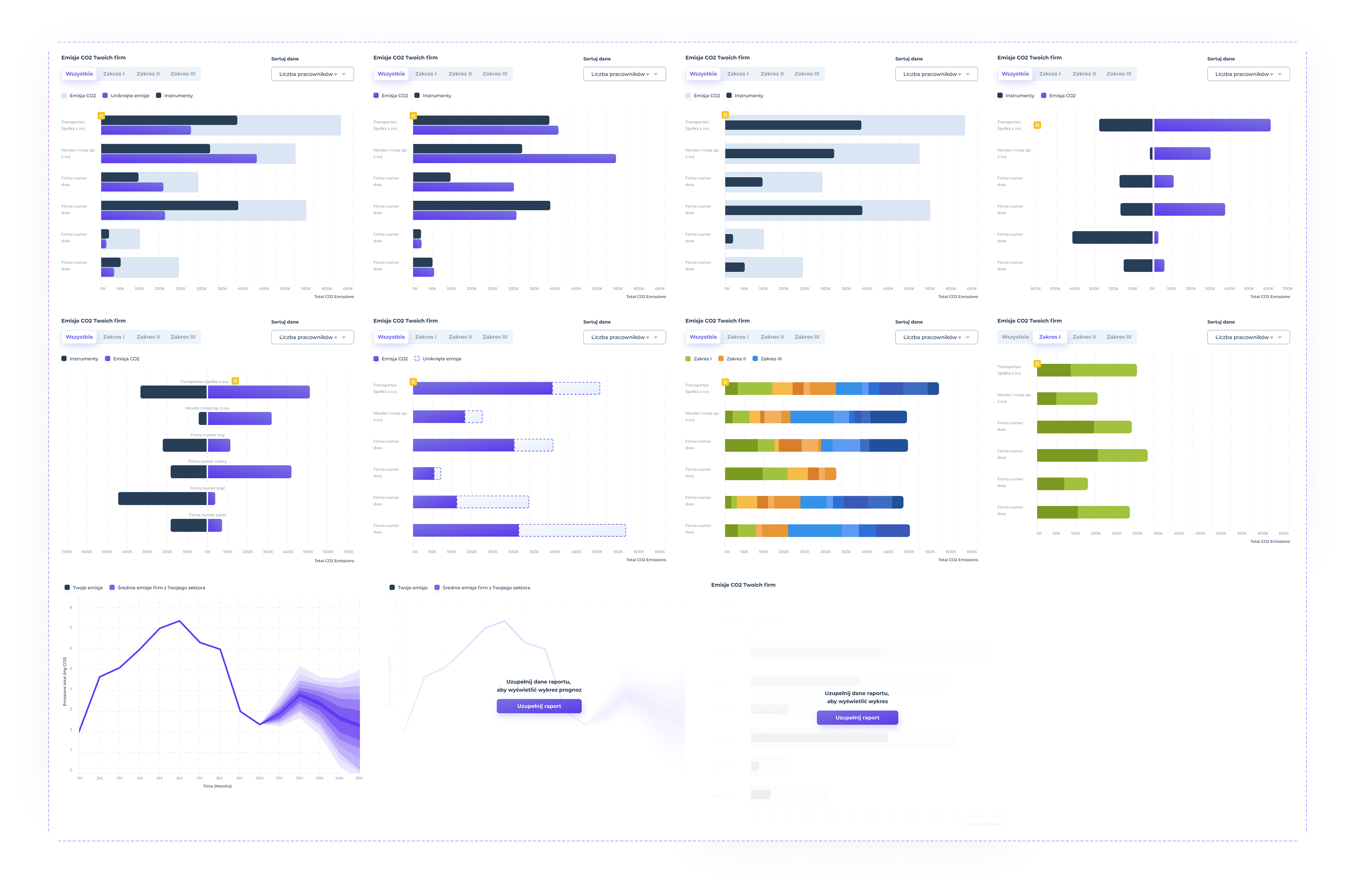
The biggest visual changes, however, concerned the dashboard itself and new ways of presenting data.
This required not only classic internal workshops and drawing flows, but also a re-meeting with specialists in the field of audits - we needed to understand what types of data sets are most important for such people and on this basis we chose the appropriate ways of presenting them.
Having everything set up, we created new visualizations in accordance with the graphic style and design system.
In the end, we worked out the best ways to move between these data, and ways to present empty or not completely filled sets.
