📝 My Role in the Project
📍Lead UX/UI designer
📍Carrying out the whole discovery phase
📍Conducting stakeholder interviews, discovery and ideation workshops
📍Writing the scripts, conducting and analyzing user interviews
📍Creating and analyzing quantitative research in form of online survey
📍Creating UX foundation document and low fidelity wireframing
📍Creating an interactive prototype and conducting moderated user tests
📍Designing the look and feel concept, and design system
📍Creating high-fidelity design prototypes
🔥 In short
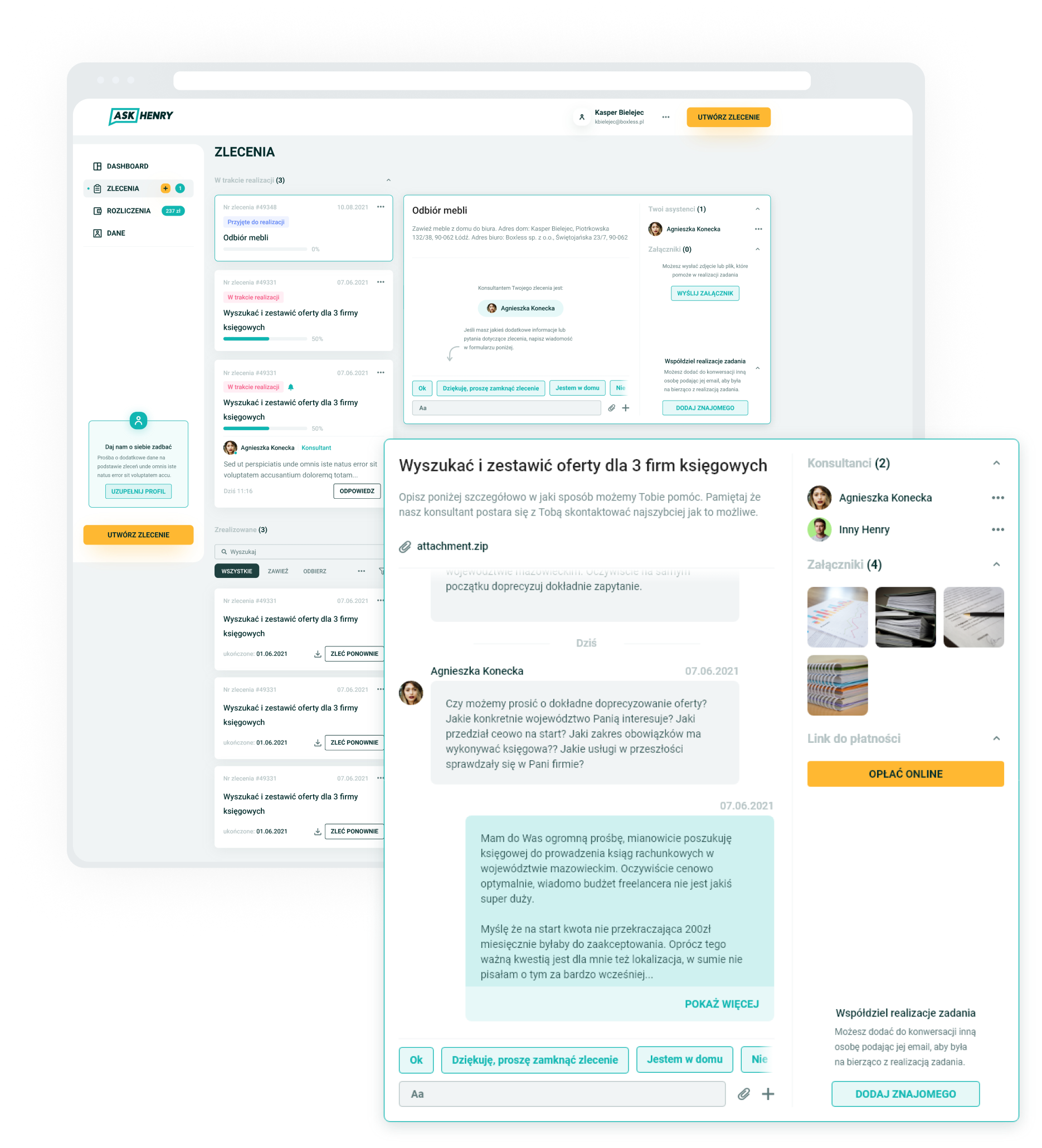
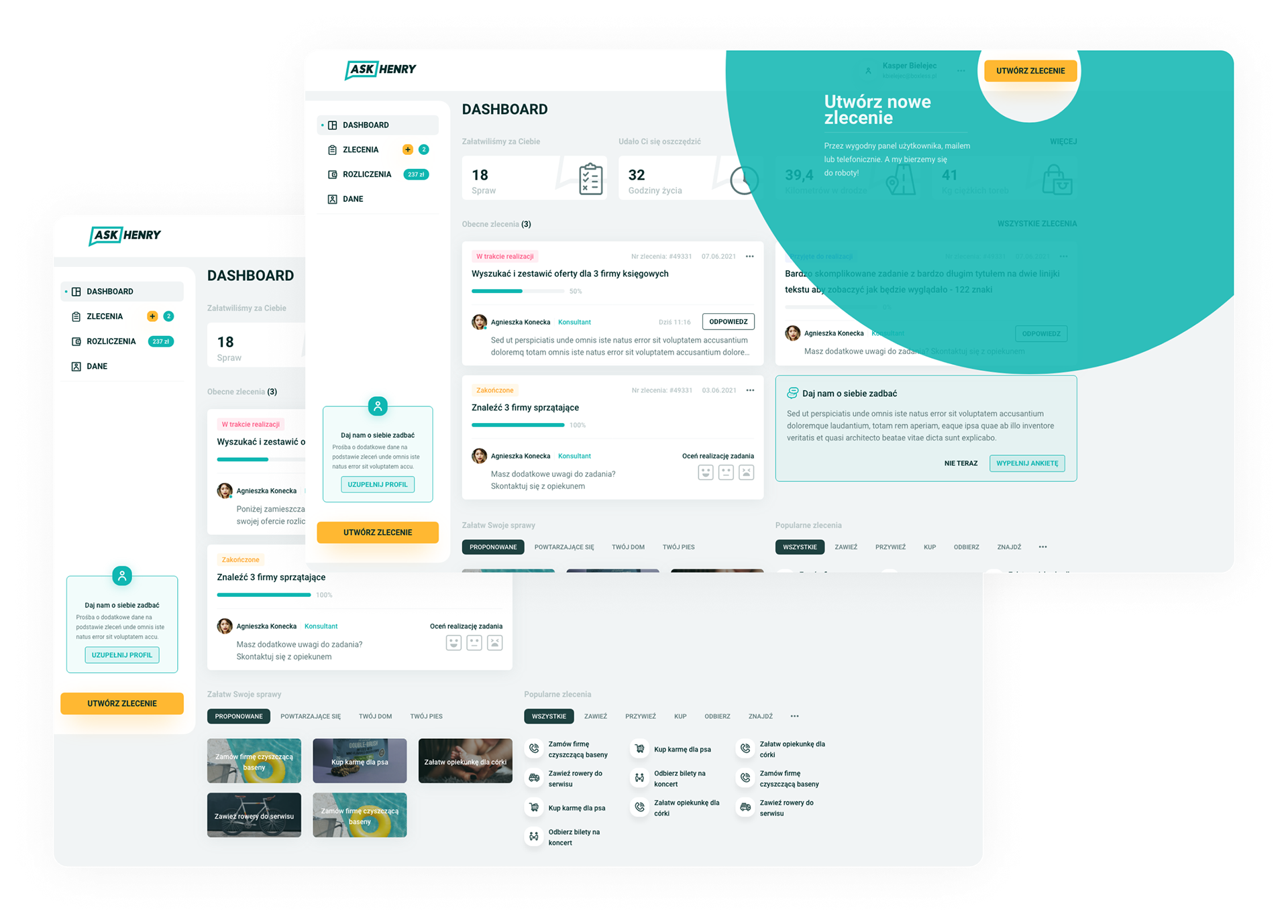
I have designed a system for ordering services provided by a personal assistant. The tool allows users, among others, to monitor task performance, communicate with the user's assistant and suggests services based on the personalization system.
✅ The Challenges
📍Creating a system that will automatically ask users for the most important information needed to complete the order without engaging the support
📍Encouraging users to order more tasks - also going beyond their current habits
📍The tool was designed to minimize the use of other communication channels with users
📍Designing a system that will be flexible enough so users can order literally anything using it, and at the same time and with such an open system, limit the presence of operating personnel in the process.
beginning of the journey
The client for whom I previously designed his whole landing page and digital identity – AskHenry – turned to me for help in improving their task ordering system for remote assistants.
AskHenry is a service in the form of a personal assistant through which users can order help in any matter or search for any information. Due to such an open system (orders placed via e-mails, text messages, telephone or even the Slack channel), the form of their submission is quite free and not very orderly. This caused a number of problems for the service and support, and then for the business itself.
Wanting to get to know them all, I started with a classic structured interview with the client to learn about his needs and the metrics he wanted to improve.
In order to additionally understand the needs and problems of users, I decided to use a number of tools.
First, I structured the users I wanted to study. On the one hand there were experienced users of the system, and on the other – people who had never used it in their life.
Of course, one of such people was myself, so in addition to IDI interviews and quantitative research carried out in the form of online surveys, I audited the current solution.
Great reveal
During the whole research process, a thought occurred to me. Namely, when placing orders, both me and my interlocutors used quite similar expressions – despite the need to arrange completely different matters by assistants.
This is how the hypothesis was created, which then turned into the basis of our new ordering system. But first, I had to validate this hypothesis. For this purpose, I asked the client to generate spreadsheet with 10,000 historic orders from the database. I then hired a UX researcher to help me analyze this data for repeating keywords.
According to my assumption, after rejecting natural speech components such as "hello", "sorry", "wouldn't it be a problem", etc., it turned out that people unknowingly algorithmize their orders. They constructed them from "building blocks" which have a repetitive formula: "do something" (e.g. bring, pick up, repair), then "what" (e.g. shoes, furniture, bicycle), "where" etc.
Then I have built around this concept a simple yet fully interactive low fidelity prototype. Which we have tested in the form of corridor tests and moderated tests on a group of target users. There was only one conclusion – each user was able to use the new system without any problems, and additionally I received a lot of valuable comments to further improve it.
UX foundation
Based on this concept as well as observations and hypotheses that I came up with while analyzing qualitative and quantitative data, I created documentation of the design and functionality of the system.
Visuals, design system and RWD
The visual layer of the design has been enriched with numerous icons and illustrations created by an illustrator cooperating with me for the needs of the client's landing page that we previously created together.
Optimized, for every user and every device
Of course, the project assumed the creation of not only a desktop version, but also a fully functional mobile version, which was to ensure 100% satisfaction for users until the native application was created.
Defensive design
I knew that the system, despite its simplicity, is quite unique. So I had to make it understandable for every user. To meet this, of course, the onboarding and feature discovery system had to appear, which would lead the user by the hand through the entire process, teaching him and showing everything along the way.
Equally important were snack bars, empty states and validation prompts.


